Most people editing images for social media, marketing, or personal projects do not need a professional-grade photo suite that takes months to learn. What they need is a tool that resizes images accurately, applies filters quickly, and adds text or design elements without a complicated workflow. The challenge is that most basic tools handle one or two of these tasks well but fall short on the others, leaving creators juggling multiple applications to finish a single image. This guide covers what to look for in an all-in-one online photo editor and the practical techniques that get the best results when resizing, filtering, and designing in a single environment.
Why All-in-One Photo Editing Has Become Essential for Creators
The number of contexts in which a single image needs to appear has expanded dramatically for most creators and brands. A product photograph taken for a website might also need to appear on Instagram, Pinterest, a newsletter, and a Facebook ad, each with different dimensions, different design treatments, and different amounts of text overlay. Meeting all of these requirements using separate tools for each step creates unnecessary complexity and introduces the risk of quality loss at every file transfer.
An all-in-one online photo editor solves this by keeping the entire process in a single environment. Resize the image to the correct dimensions for each platform, apply a filter treatment that matches the brand aesthetic, add a text overlay with the relevant copy, drop in a sticker or graphic element for visual interest, and export for each destination, all without leaving the same tool or working from a saved draft. This kind of consolidated workflow is faster, produces more consistent results, and requires far less technical knowledge than managing separate specialized tools.
The growth of all-in-one editing tools has also been driven by accessibility demands. Social media managers, small business owners, independent creators, and marketing teams without dedicated designers all need to produce polished image content regularly and quickly. Professional photo editing software designed for technical specialists is not the right tool for this use case, both because of the learning curve and because its feature set is oriented around problems these users do not have.
What to Look for in an Online Photo Editor
The market for online photo editing tools is crowded, and the quality gap between strong and weak platforms is significant. The key capabilities to evaluate are resizing accuracy and flexibility, filter quality and variety, the depth of the text and design element toolkit, and the overall usability of the editing interface.
Resizing accuracy matters more than it might seem. A tool that resizes by simply stretching or squashing pixels without intelligent resampling produces blurry, distorted results, particularly when the aspect ratio of the resized image differs from the original. A good online editor uses proper interpolation algorithms that produce crisp results and offers both pixel-dimension input for precise control and platform presets that remove the need to memorize specific dimensions.
Filter quality is another meaningful differentiator. Filters that apply a flat color grade uniformly across every image look artificial beyond the most casual use. The best online editors offer filters built on sophisticated color grading logic that can be adjusted in intensity and that interact intelligently with the brightness, contrast, and color values already present in the image. The difference between ten thoughtfully designed filters and a hundred generic presets is visible in the professionalism of the final image.
See also: Cawley Bergmann: Profile and Updates
10 Tips for Getting the Most Out of an Online Photo Editor
1. Resize for the Specific Platform Before Applying Any Other Edits
The sequence of operations in photo editing matters. Resizing should happen before applying filters, adding text, or placing stickers, because all of these elements are positioned and sized relative to the canvas dimensions. If you add a text overlay at a specific position on a large canvas and then resize the image significantly, the text will be repositioned or scaled in ways that may not match the original intent. Starting with the correct dimensions means every subsequent edit is made in the context of the final output size.
This is especially important when producing images for multiple platforms from a single source. Begin by duplicating the original image for each destination platform, resize each copy to the correct dimensions for its target, and then apply filters, text, and design elements to each version separately. This approach requires slightly more initial setup than editing once and exporting at different sizes, but it produces better results because the layout, text sizing, and element placement are all optimized for each specific output format.
2. Use Platform-Specific Presets to Eliminate Dimension Guesswork
Memorizing the correct image dimensions for every social media platform and distribution channel is neither practical nor necessary when a good online photo editor provides platform-specific resize presets. Most well-designed tools include presets for common destinations including Instagram posts, Instagram Stories and Reels, Facebook covers, Twitter headers, LinkedIn posts, YouTube thumbnails, Pinterest pins, and standard print sizes. Selecting the correct preset ensures you are working with dimensions that will display correctly on the target platform without cropping, letterboxing, or automatic compression artifacts.
Preset libraries are also a useful reference for understanding the aspect ratio requirements of different platforms, even if you ultimately enter custom dimensions. An Instagram post preset that produces a 1:1 square or a 4:5 portrait communicates the aspect ratio logic of that platform in a way that is easy to internalize with repeated use. Over time, familiarity with these presets builds an intuitive understanding of how different image formats behave across contexts.
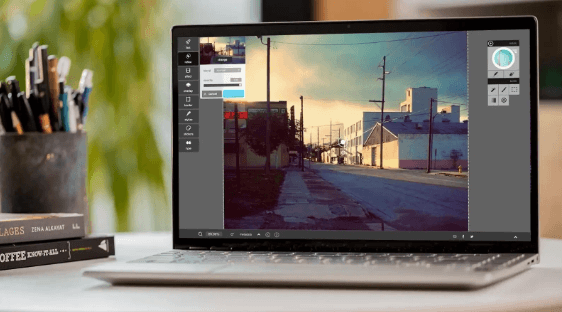
3. Use Adobe Express to Resize Images and Apply Design Elements in One Place
For creators who need to resize images and apply filters, text, and design elements without switching between tools, Adobe Express offers an integrated solution with a dedicated resize image feature alongside a full suite of creative editing tools. The platform supports pixel-precise custom dimensions and platform-specific presets, and the resizing step connects directly to the same editing environment used for applying filters, adding text overlays, placing stickers and graphic elements, and exporting in multiple formats.
The practical advantage of this integration is that a resized image moves immediately into the next editing step without being saved, exported, and re-imported into a separate tool. For creators managing multiple image assets across multiple platforms, the time saved by keeping the entire process inside a single environment is significant, and output consistency improves because every design decision is being made and reviewed in the same visual context. The free tier of Adobe Express includes the resize feature and core design tools, making it accessible without a financial commitment.
4. Apply Filters at Reduced Intensity for a More Professional Result
One of the most reliable ways to make filter-enhanced images look more polished rather than heavily processed is to apply filters at less than their full intensity. Most online photo editors allow you to adjust a filter’s strength on a scale, and defaulting to 100 percent intensity on most filters produces an effect that looks visually heavy and processed to a trained eye. Reducing filter intensity to between 50 and 75 percent typically produces a more natural result that enhances the image without overpowering the original content.
The appropriate filter intensity also depends on the type of image and its intended use. A lifestyle photograph used in an Instagram post can often support a stronger color grade than a product image in an e-commerce context, where accurate color representation matters more than aesthetic enhancement. Portraits generally benefit from more restrained filter application than landscapes or architectural images, since heavy color grading on skin tones is particularly obvious. Reviewing edited images on multiple screens before publishing catches intensity issues that may not be visible on a single device.
5. Choose Filters That Match Your Brand’s Existing Color Aesthetic
Filters are most effective when they reinforce rather than contradict the existing visual identity of a brand or creator. A brand that communicates warmth, approachability, and natural quality is not well served by a high-contrast, desaturated filter treatment, even if that filter produces an appealing result in isolation. Consistency of color aesthetic across all brand imagery builds visual recognition over time, and the filter choices applied to individual images are one of the primary tools available for creating and maintaining that consistency.
Before applying a filter to any image intended for brand or business use, identify the color temperature, saturation level, and contrast characteristics that best represent the intended aesthetic, and use these as criteria for filter selection. Once you have identified one or two filters that reliably produce the right result, use them consistently across all edited images rather than varying the treatment. A consistent filter creates a visual signature that audiences associate with your content, strengthening recognition across every image you publish.
6. Layer Text Strategically for Readability and Visual Impact
Text overlays on images are one of the most common design elements in social media and marketing content, and they are also one of the most commonly executed poorly. Text that cannot be read at a glance because of poor contrast with the underlying image, text that competes visually with the photograph’s main subject, and text that is sized inconsistently with the image dimensions all reduce the effectiveness of the design significantly.
The key principles for effective text placement on images are contrast, hierarchy, and zone selection. Contrast between text color and the underlying image must be strong enough that the text is immediately legible without effort, achieved through a text backing, a semi-transparent overlay, or a deliberately dark or light area of the image. Hierarchy means the most important text is the largest and most visually prominent, with supporting information clearly subordinate. Zone selection means placing text where it does not overlap the primary subject, typically in a sky, background area, or empty foreground zone the photograph provides.
7. Use Stickers and Design Elements as Accents, Not Focal Points
Sticker libraries and graphic design elements in online photo editors are tools for visual emphasis and context, not substitutes for strong photography or compelling copy. The most effective use of stickers in social media and marketing images is to direct attention, add a layer of information, or reinforce the tone of the image without competing with the main subject for visual dominance. A small arrow pointing to a key product detail, a subtle badge indicating a sale or a new arrival, or a simple frame element that reinforces the brand aesthetic all accomplish this without cluttering the image.
When evaluating sticker and design element libraries in a photo editing platform, look for assets that are stylistically cohesive and cover the specific use cases relevant to your content. A library with a few hundred well-designed assets organized by category is more useful than one with thousands of random elements. Pay attention to whether stickers are available in multiple color variants or can be recolored to match your brand palette, since out-of-palette accent elements in an otherwise brand-consistent image create visual dissonance that undermines the overall design.
8. Match Font Choices to the Image Subject and Brand Identity
The typeface used for text overlays on an edited image communicates as much about the content’s tone and brand positioning as the image itself. A bold, geometric sans-serif conveys a different personality than a casual handwritten script, and neither is appropriate for every context. Choosing a font that conflicts with the subject matter or brand identity of the image creates a dissonance that most viewers will register even if they cannot identify it explicitly.
Most online photo editors offer a curated selection of fonts ranging from formal to casual, modern to classic, and display to body text. Rather than defaulting to the platform’s suggested font, make an intentional choice based on how well the font matches the image’s tone, whether it aligns with the brand’s typographic identity, and whether it is legible at the size it will be displayed. Limit text overlays to one or two typefaces per image, since using more creates visual noise that undermines clarity and professional appearance.
9. Export at the Correct Resolution and File Format for Each Destination
The quality of a carefully edited image can be compromised significantly by an incorrect export setting. Exporting at too low a resolution produces images that appear soft or pixelated on high-density screens. Exporting at unnecessarily high resolution inflates file sizes in ways that can slow page load times and exceed platform upload limits. Choosing the wrong file format can introduce compression artifacts, remove transparency, or produce files that display incorrectly in certain environments.
The practical guidance is straightforward: use PNG for images that require transparent backgrounds or contain text and flat graphics where lossless quality matters; use JPEG for photographic images where file size is a consideration and transparency is not required; use WebP for web environments where its smaller file sizes at equivalent visual quality deliver a meaningful performance advantage. For social media specifically, most platforms accept JPEG and PNG and apply their own compression on upload, so exporting at the platform’s recommended pixel dimensions with a high-quality JPEG setting produces the best balance of upload quality and file size.
10. Save Edited Image Versions With Clear File Names Before Distributing
Managing multiple edited versions of the same source image, each sized and designed for a different platform or use case, becomes confusing quickly without a disciplined file naming system. Without clear naming, it is easy to distribute the wrong version of an image, use an older draft when a corrected version exists, or be unable to find a previously edited asset when it needs to be reused or updated.
Establish a consistent naming convention before editing any image that will produce multiple output versions. A format that includes the content subject, destination platform, and editing date, such as ProductShot_Instagram_April2026, provides enough information to identify the correct file without opening it. Store finished versions in a clearly labeled folder structure organized by project or campaign, and keep the source file alongside exported versions so that changes can always be made from the original rather than from a previously compressed copy.
Frequently Asked Questions
What is the difference between resizing and cropping an image?
Resizing changes the overall pixel dimensions of an image, making the entire canvas larger or smaller while preserving all of the original content within the frame. Cropping removes portions of the image by changing the boundaries of the frame, which changes both the content and the dimensions. The two operations are often used together: crop to select the most visually effective portion of a photograph, then resize the cropped version to the exact pixel dimensions required for a specific platform. Understanding this distinction prevents the common error of trying to achieve an aspect ratio change through resizing alone, which stretches or compresses the image rather than selecting a portion of it.
Does resizing an image reduce its quality?
Resizing down, which means reducing pixel dimensions, generally has a minimal effect on perceived image quality as long as the resampling is handled correctly by the editing tool. The image contains more pixel data than the smaller size requires, so pixels are intelligently combined in a process that preserves sharpness well. Resizing up, which means increasing pixel dimensions beyond the original, is where quality degradation becomes significant. Upscaling a raster image requires the software to generate pixel data that did not exist in the original, which produces varying degrees of softness and artificial-looking edges depending on the algorithm used. For best results, always start from the highest-resolution version of a source image and resize down rather than up.
What image dimensions do I need for major social media platforms?
Social media image dimensions change periodically as platforms update their interfaces and display specifications. As a working reference, Instagram square posts perform best at 1080 by 1080 pixels, portrait posts at 1080 by 1350 pixels, and Stories at 1080 by 1920 pixels. Facebook link previews display best at 1200 by 630 pixels, and cover photos at 820 by 312 pixels. LinkedIn single-image posts work well at 1200 by 627 pixels, and Pinterest pins at 1000 by 1500 pixels. For always-current specifications across all major platforms, Sprout Social’s image size guide is a regularly updated reference that covers every major platform and placement type.
Can I add text and stickers to an image without reducing its visual quality?
Text and sticker elements added in an online photo editor are composited onto the image within the editing environment and rendered into the final file at export. When exported at the correct resolution and in a format that supports the required quality level, the resulting file preserves the quality of the underlying image while incorporating added elements cleanly. The quality risk comes not from the additions themselves but from the export settings applied when the finished image is saved, so exporting at a high-quality setting and at the correct pixel dimensions for the intended display context is what matters most.
What is the best file format to save a photo after adding filters and design elements?
The best format depends on the intended use. PNG is the right choice when the image has a transparent background or contains text, logos, and flat graphics where pixel-perfect sharpness is critical, since PNG uses lossless compression. JPEG is the standard choice for photographic images without transparency, offering significant file size reduction through lossy compression that is largely imperceptible at high quality settings. For web use where both performance and compatibility matter, WebP offers the smallest file sizes at equivalent visual quality and is supported by all major modern browsers. Avoid saving and re-saving JPEG files multiple times, since each save compounds quality loss through successive rounds of lossy compression.
Conclusion
An online photo editor that combines resizing, filters, stickers, and text in a single workflow removes the friction that makes image editing tedious for anyone producing content at volume. The tips in this guide cover the full range of decisions that determine whether an edited image looks polished and intentional or processed and generic, from the sequence of editing operations to the filter intensity that distinguishes professional from amateur results. Start with the correct dimensions, apply design elements with purpose and restraint, and export at the right settings for each destination.